import pandas as pd
import numpy as np
import tidyfinance as tfWorking with Stock Returns
Note
You are reading Tidy Finance with Python. You can find the equivalent chapter for the sibling Tidy Finance with R here.
The main aim of this chapter is to familiarize yourself with the core packages for working with stock market data. We focus on downloading and visualizing stock data from data provider Yahoo Finance.
At the start of each session, we load the required Python packages. Throughout the entire book, we always use the pandas (McKinney 2010) and numpy (Harris et al. 2020) packages. In this chapter, we also load the tidyfinance package to download stock price data. This package provides a convenient wrapper for various quantitative functions compatible with the core packages and our book.
You typically have to install a package once before you can load it into your active R session. In case you have not done this yet, call, for instance, pip install tidyfinance in your terminal.
Downloading Data
Note that import pandas as pd implies that we can call all pandas functions later with a simple pd.function(). Instead, utilizing from pandas import * is generally discouraged, as it leads to namespace pollution. This statement imports all functions and classes from pandas into your current namespace, potentially causing conflicts with functions you define or those from other imported libraries. Using the pd abbreviation is a very convenient way to prevent this.
We first download daily prices for one stock symbol, e.g., the Apple stock (AAPL), directly from the data provider Yahoo Finance. To download the data, you can use the function tf.download_data().
In the following code, we request daily data from the beginning of 2000 to the end of the last year, which is a period of more than 20 years.
prices = tf.download_data(
  domain="stock_prices",
  symbols="AAPL",
  start_date="2000-01-01",
  end_date="2023-12-31"
)
prices.head().round(3)| date | symbol | volume | open | low | high | close | adjusted_close | |
|---|---|---|---|---|---|---|---|---|
| 0 | 2000-01-03 | AAPL | 535796800 | 0.936 | 0.908 | 1.004 | 0.999 | 0.842 |
| 1 | 2000-01-04 | AAPL | 512377600 | 0.967 | 0.903 | 0.988 | 0.915 | 0.771 |
| 2 | 2000-01-05 | AAPL | 778321600 | 0.926 | 0.920 | 0.987 | 0.929 | 0.782 |
| 3 | 2000-01-06 | AAPL | 767972800 | 0.948 | 0.848 | 0.955 | 0.848 | 0.715 |
| 4 | 2000-01-07 | AAPL | 460734400 | 0.862 | 0.853 | 0.902 | 0.888 | 0.749 |
tf.download_data(domain="stock_prices") downloads stock market data from Yahoo Finance. The above code chunk returns a data frame with eight self-explanatory columns: date, symbol, the daily volume (in the number of traded shares), the market prices at the open, low, high, close, and the adjusted_close price in USD. The adjusted prices are corrected for anything that might affect the stock price after the market closes, e.g., stock splits and dividends. These actions affect the quoted prices, but they have no direct impact on the investors who hold the stock. Therefore, we often rely on adjusted prices when it comes to analyzing the returns an investor would have earned by holding the stock continuously.
Next, we use the plotnine package (Kibirige 2023) to visualize the time series of adjusted prices in Figure 1. This package takes care of visualization tasks based on the principles of the grammar of graphics (Wilkinson 2012). Note that generally, we do not recommend using the * import style. However, we use it here only for the plotting functions, which are distinct to plotnine and have very plotting-related names. So, the risk of misuse through a polluted namespace is marginal.
from plotnine import *Creating figures becomes very intuitive with the Grammar of Graphics, as the following code chunk demonstrates.
apple_prices_figure = (
  ggplot(prices, aes(y="adjusted_close", x="date"))
  + geom_line()
  + labs(x="", y="", title="Apple stock prices from 2000 to 2023")
)
apple_prices_figure.show()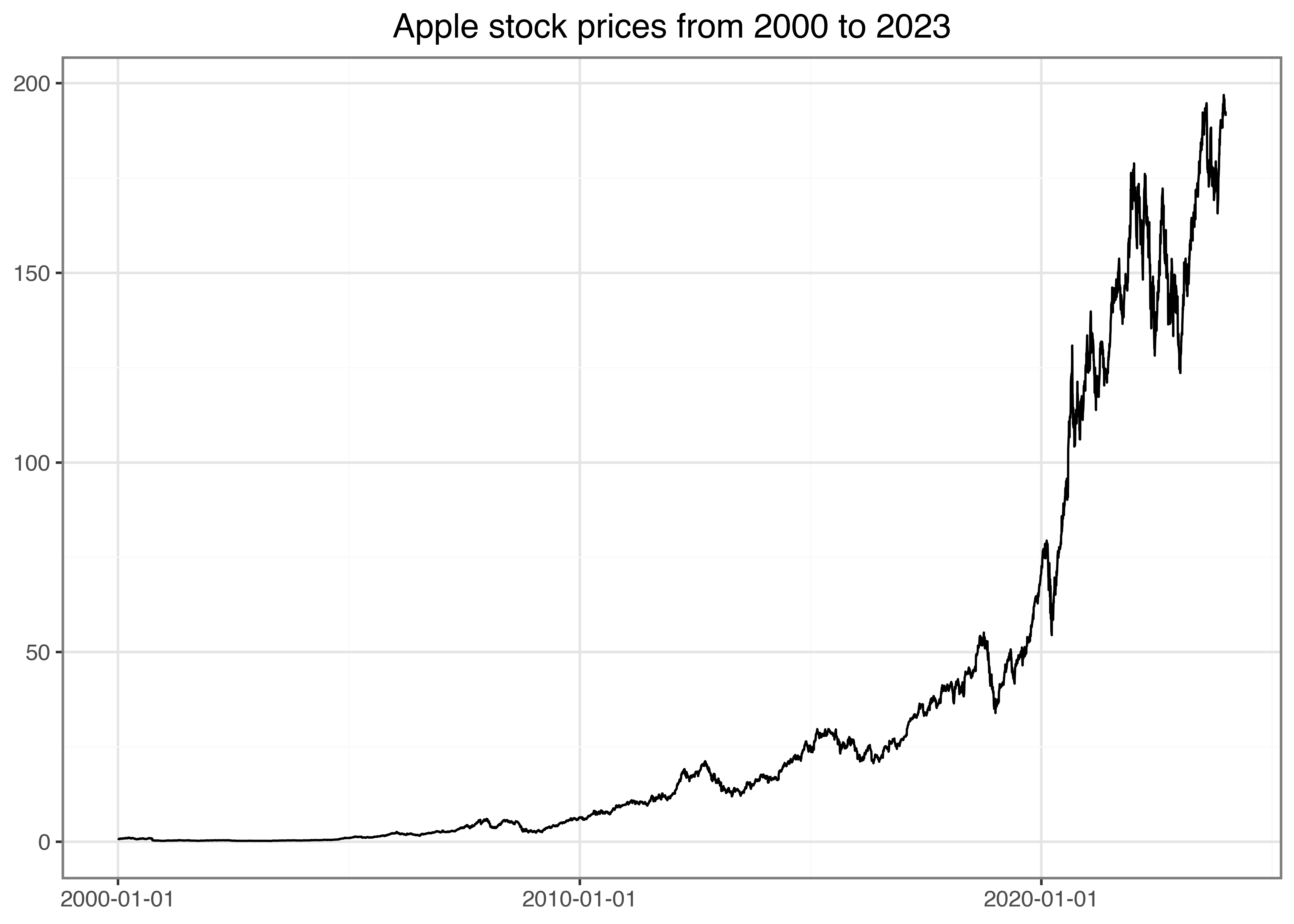
Computing Returns
Instead of analyzing prices, we compute daily returns defined as \(r_t = p_t / p_{t-1} - 1\), where \(p_t\) is the adjusted price at the end of day \(t\). In that context, the function lag() is helpful by returning the previous value.
returns = (prices
  .sort_values("date")
  .assign(ret=lambda x: x["adjusted_close"].pct_change())
  .get(["symbol", "date", "ret"])
)
returns| symbol | date | ret | |
|---|---|---|---|
| 0 | AAPL | 2000-01-03 | NaN |
| 1 | AAPL | 2000-01-04 | -0.084310 |
| 2 | AAPL | 2000-01-05 | 0.014633 |
| 3 | AAPL | 2000-01-06 | -0.086538 |
| 4 | AAPL | 2000-01-07 | 0.047369 |
| ... | ... | ... | ... |
| 6032 | AAPL | 2023-12-22 | -0.005547 |
| 6033 | AAPL | 2023-12-26 | -0.002841 |
| 6034 | AAPL | 2023-12-27 | 0.000518 |
| 6035 | AAPL | 2023-12-28 | 0.002226 |
| 6036 | AAPL | 2023-12-29 | -0.005424 |
6037 rows × 3 columns
The resulting data frame has three columns, the last of which contains the daily returns (ret). Note that the first entry naturally contains a missing value (NaN) because there is no previous price. Obviously, the use of pct_change() would be meaningless if the time series is not ordered by ascending dates. The function sort_values() provides a convenient way to order observations in the correct way for our application. In case you want to order observations by descending dates, you can use the parameter ascending=False.
For the upcoming examples, we remove missing values as these would require separate treatment for many applications. For example, missing values can affect sums and averages by reducing the number of valid data points if not properly accounted for. In general, always ensure you understand why NaN values occur and carefully examine if you can simply get rid of these observations.
returns = returns.dropna() Next, we visualize the distribution of daily returns in a histogram in Figure 2. Additionally, we draw a dashed line that indicates the historical five percent quantile of the daily returns to the histogram, which is a crude proxy for the worst possible return of the stock with a probability of at most five percent. This quantile is closely connected to the (historical) value-at-risk, a risk measure commonly monitored by regulators. We refer to Tsay (2010) for a more thorough introduction to the stylized facts of financial returns.
from mizani.formatters import percent_format

quantile_05 = returns["ret"].quantile(0.05)

apple_returns_figure = (
  ggplot(returns, aes(x="ret"))
  + geom_histogram(bins=100)
  + geom_vline(aes(xintercept=quantile_05), linetype="dashed")
  + labs(x="", y="", title="Distribution of daily Apple stock returns")
  + scale_x_continuous(labels=percent_format())
)
apple_returns_figure.show()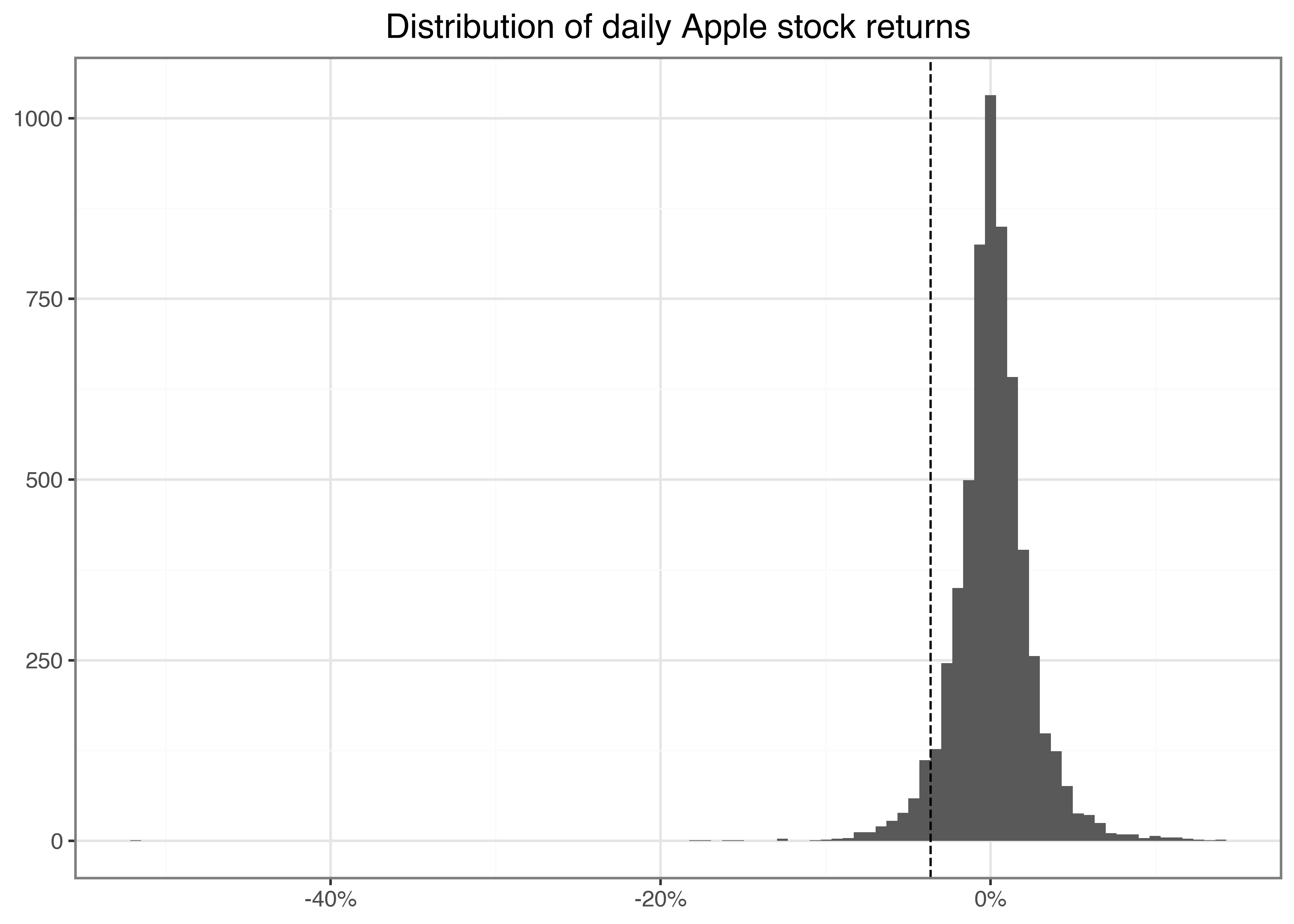
Here, bins=100 determines the number of bins used in the illustration and, hence, implicitly sets the width of the bins. Before proceeding, make sure you understand how to use the geom geom_vline() to add a dashed line that indicates the historical five percent quantile of the daily returns. Before proceeding with any data, a typical task is to compute and analyze the summary statistics for the main variables of interest.
pd.DataFrame(returns["ret"].describe()).round(3).T| count | mean | std | min | 25% | 50% | 75% | max | |
|---|---|---|---|---|---|---|---|---|
| ret | 6036.0 | 0.001 | 0.025 | -0.519 | -0.01 | 0.001 | 0.013 | 0.139 |
We see that the maximum daily return was 13.9 percent. Perhaps not surprisingly, the average daily return is close to but slightly above 0. In line with the illustration above, the large losses on the day with the minimum returns indicate a strong asymmetry in the distribution of returns.
You can also compute these summary statistics for each year individually by imposing groupby(returns["date"].dt.year), where the call dt.year returns the year. More specifically, the few lines of code below compute the summary statistics from above for individual groups of data defined by the values of the column year. The summary statistics, therefore, allow an eyeball analysis of the time-series dynamics of the daily return distribution.
(returns["ret"]
  .groupby(returns["date"].dt.year)
  .describe()
  .round(3)
)| count | mean | std | min | 25% | 50% | 75% | max | |
|---|---|---|---|---|---|---|---|---|
| date | ||||||||
| 2000 | 251.0 | -0.003 | 0.055 | -0.519 | -0.034 | -0.002 | 0.027 | 0.137 |
| 2001 | 248.0 | 0.002 | 0.039 | -0.172 | -0.023 | -0.001 | 0.027 | 0.129 |
| 2002 | 252.0 | -0.001 | 0.031 | -0.150 | -0.019 | -0.003 | 0.018 | 0.085 |
| 2003 | 252.0 | 0.002 | 0.023 | -0.081 | -0.012 | 0.002 | 0.015 | 0.113 |
| 2004 | 252.0 | 0.005 | 0.025 | -0.056 | -0.009 | 0.003 | 0.016 | 0.132 |
| 2005 | 252.0 | 0.003 | 0.024 | -0.092 | -0.010 | 0.003 | 0.017 | 0.091 |
| 2006 | 251.0 | 0.001 | 0.024 | -0.063 | -0.014 | -0.002 | 0.014 | 0.118 |
| 2007 | 251.0 | 0.004 | 0.024 | -0.070 | -0.009 | 0.003 | 0.018 | 0.105 |
| 2008 | 253.0 | -0.003 | 0.037 | -0.179 | -0.024 | -0.001 | 0.019 | 0.139 |
| 2009 | 252.0 | 0.004 | 0.021 | -0.050 | -0.009 | 0.002 | 0.015 | 0.068 |
| 2010 | 252.0 | 0.002 | 0.017 | -0.050 | -0.006 | 0.002 | 0.011 | 0.077 |
| 2011 | 252.0 | 0.001 | 0.017 | -0.056 | -0.009 | 0.001 | 0.011 | 0.059 |
| 2012 | 250.0 | 0.001 | 0.019 | -0.064 | -0.008 | 0.000 | 0.012 | 0.089 |
| 2013 | 252.0 | 0.000 | 0.018 | -0.124 | -0.009 | -0.000 | 0.011 | 0.051 |
| 2014 | 252.0 | 0.001 | 0.014 | -0.080 | -0.006 | 0.001 | 0.010 | 0.082 |
| 2015 | 252.0 | 0.000 | 0.017 | -0.061 | -0.009 | -0.001 | 0.009 | 0.057 |
| 2016 | 252.0 | 0.001 | 0.015 | -0.066 | -0.006 | 0.001 | 0.008 | 0.065 |
| 2017 | 251.0 | 0.002 | 0.011 | -0.039 | -0.004 | 0.001 | 0.007 | 0.061 |
| 2018 | 251.0 | -0.000 | 0.018 | -0.066 | -0.009 | 0.001 | 0.009 | 0.070 |
| 2019 | 252.0 | 0.003 | 0.016 | -0.100 | -0.005 | 0.003 | 0.012 | 0.068 |
| 2020 | 253.0 | 0.003 | 0.029 | -0.129 | -0.010 | 0.002 | 0.017 | 0.120 |
| 2021 | 252.0 | 0.001 | 0.016 | -0.042 | -0.008 | 0.001 | 0.012 | 0.054 |
| 2022 | 251.0 | -0.001 | 0.022 | -0.059 | -0.016 | -0.001 | 0.014 | 0.089 |
| 2023 | 250.0 | 0.002 | 0.013 | -0.048 | -0.006 | 0.002 | 0.009 | 0.047 |
Scaling Up the Analysis
As a next step, we generalize the previous code so that all computations can handle an arbitrary number of symbols (e.g., all constituents of an index). Following tidy principles, it is quite easy to download the data, plot the price time series, and tabulate the summary statistics for an arbitrary number of assets.
This is where the tidyverse magic starts: Tidy data makes it extremely easy to generalize the computations from before to as many assets or groups as you like. The following code takes any number of symbols, e.g., symbol = ["AAPL", "MMM", "BA"], and automates the download as well as the plot of the price time series. In the end, we create the table of summary statistics for all assets at once. For this example, we analyze data from all current constituents of the Dow Jones Industrial Average index.
We first download a table with DOW Jones constituents again using tf.download_data(), but this time with domain="constituents".
symbols = tf.download_data(
  domain="constituents",
  index="Dow Jones Industrial Average"
)
Conveniently, tf.download_data() provides the functionality to get all stock prices from an index for a specific point in time with a single call.
prices_daily = tf.download_data(
  domain="stock_prices",
  symbols=symbols["symbol"].tolist(),
  start_date="2000-01-01",
  end_date="2023-12-31"
)
The resulting data frame contains 177,925 daily observations for 30 different stocks. Figure 3 illustrates the time series of the downloaded adjusted prices for each of the constituents of the Dow index. Make sure you understand every single line of code! What are the arguments of aes()? Which alternative geoms could you use to visualize the time series? Hint: if you do not know the answers try to change the code to see what difference your intervention causes.
from mizani.breaks import date_breaks
from mizani.formatters import date_format

prices_figure = (
  ggplot(prices_daily, aes(y="adjusted_close", x="date", color="symbol"))
  + geom_line()
  + scale_x_datetime(date_breaks="5 years", date_labels="%Y")
  + labs(x="", y="", color="", title="Stock prices of DOW index constituents")
  + theme(legend_position="none")
)
prices_figure.show()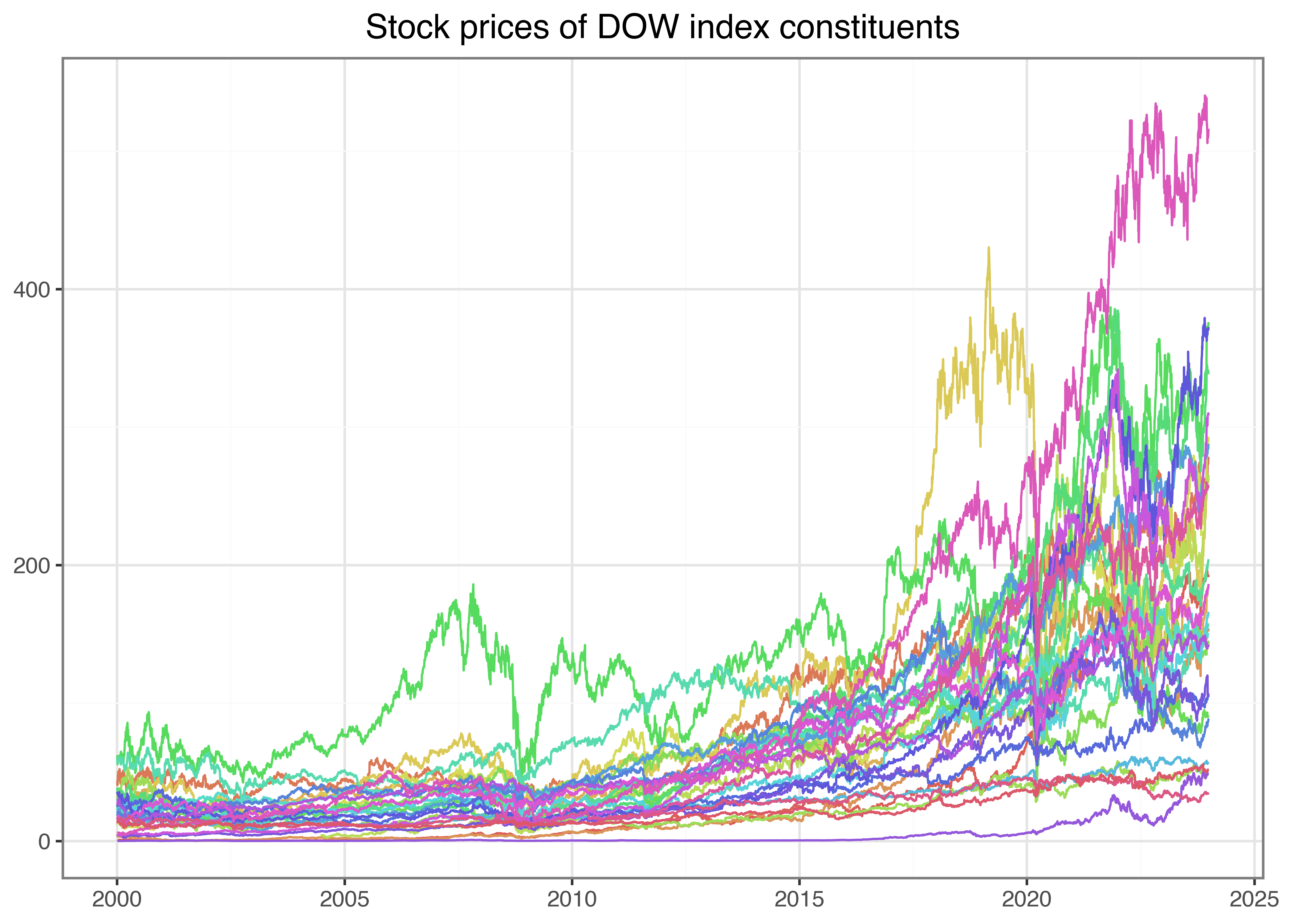
Do you notice the small differences relative to the code we used before? All we needed to do to illustrate all stock symbols simultaneously is to include color = symbol in the ggplot aesthetics. In this way, we generate a separate line for each symbol. Of course, there are simply too many lines on this graph to identify the individual stocks properly, but it illustrates our point of how to generalize a specific analysis to an arbitrage number of subjects quite well.
The same holds for stock returns. Before computing the returns, we use groupby("symbol") such that the assign() command is performed for each symbol individually. The same logic also applies to the computation of summary statistics: groupby("symbol") is the key to aggregating the time series into symbol-specific variables of interest.
returns_daily = (prices_daily
  .assign(ret=lambda x: x.groupby("symbol")["adjusted_close"].pct_change())
  .get(["symbol", "date", "ret"])
  .dropna(subset="ret")
)

(returns_daily
  .groupby("symbol")["ret"]
  .describe()
  .round(3)
)| count | mean | std | min | 25% | 50% | 75% | max | |
|---|---|---|---|---|---|---|---|---|
| symbol | ||||||||
| AAPL | 6036.0 | 0.001 | 0.025 | -0.519 | -0.010 | 0.001 | 0.013 | 0.139 |
| AMGN | 6036.0 | 0.000 | 0.019 | -0.134 | -0.009 | 0.000 | 0.009 | 0.151 |
| AMZN | 6036.0 | 0.001 | 0.032 | -0.248 | -0.012 | 0.000 | 0.014 | 0.345 |
| AXP | 6036.0 | 0.001 | 0.023 | -0.176 | -0.009 | 0.000 | 0.010 | 0.219 |
| BA | 6036.0 | 0.001 | 0.022 | -0.238 | -0.010 | 0.001 | 0.011 | 0.243 |
| CAT | 6036.0 | 0.001 | 0.020 | -0.145 | -0.010 | 0.001 | 0.011 | 0.147 |
| CRM | 4914.0 | 0.001 | 0.027 | -0.271 | -0.012 | 0.001 | 0.014 | 0.260 |
| CSCO | 6036.0 | 0.000 | 0.023 | -0.162 | -0.009 | 0.000 | 0.010 | 0.244 |
| CVX | 6036.0 | 0.001 | 0.018 | -0.221 | -0.008 | 0.001 | 0.009 | 0.227 |
| DIS | 6036.0 | 0.000 | 0.019 | -0.184 | -0.009 | 0.000 | 0.009 | 0.160 |
| GS | 6036.0 | 0.001 | 0.023 | -0.190 | -0.010 | 0.000 | 0.011 | 0.265 |
| HD | 6036.0 | 0.001 | 0.019 | -0.287 | -0.008 | 0.001 | 0.009 | 0.141 |
| HON | 6036.0 | 0.000 | 0.019 | -0.174 | -0.008 | 0.001 | 0.009 | 0.282 |
| IBM | 6036.0 | 0.000 | 0.016 | -0.155 | -0.007 | 0.000 | 0.008 | 0.120 |
| JNJ | 6036.0 | 0.000 | 0.012 | -0.158 | -0.005 | 0.000 | 0.006 | 0.122 |
| JPM | 6036.0 | 0.001 | 0.024 | -0.207 | -0.009 | 0.000 | 0.010 | 0.251 |
| KO | 6036.0 | 0.000 | 0.013 | -0.101 | -0.005 | 0.000 | 0.006 | 0.139 |
| MCD | 6036.0 | 0.001 | 0.015 | -0.159 | -0.006 | 0.001 | 0.007 | 0.181 |
| MMM | 6036.0 | 0.000 | 0.015 | -0.129 | -0.007 | 0.000 | 0.008 | 0.126 |
| MRK | 6036.0 | 0.000 | 0.017 | -0.268 | -0.007 | 0.000 | 0.008 | 0.130 |
| MSFT | 6036.0 | 0.001 | 0.019 | -0.156 | -0.008 | 0.000 | 0.009 | 0.196 |
| NKE | 6036.0 | 0.001 | 0.019 | -0.198 | -0.008 | 0.001 | 0.009 | 0.155 |
| NVDA | 6036.0 | 0.002 | 0.038 | -0.352 | -0.016 | 0.001 | 0.018 | 0.424 |
| PG | 6036.0 | 0.000 | 0.013 | -0.302 | -0.005 | 0.000 | 0.006 | 0.120 |
| SHW | 6036.0 | 0.001 | 0.018 | -0.208 | -0.008 | 0.001 | 0.009 | 0.153 |
| TRV | 6036.0 | 0.001 | 0.018 | -0.208 | -0.007 | 0.001 | 0.008 | 0.256 |
| UNH | 6036.0 | 0.001 | 0.020 | -0.186 | -0.008 | 0.001 | 0.010 | 0.348 |
| V | 3973.0 | 0.001 | 0.019 | -0.136 | -0.008 | 0.001 | 0.009 | 0.150 |
| VZ | 6036.0 | 0.000 | 0.015 | -0.118 | -0.007 | 0.000 | 0.007 | 0.146 |
| WMT | 6036.0 | 0.000 | 0.015 | -0.114 | -0.007 | 0.000 | 0.007 | 0.117 |
Different Frequencies
Financial data often exists at different frequencies due to varying reporting schedules, trading calendars, and economic data releases. For example, stock prices are typically recorded daily, while macroeconomic indicators such as GDP or inflation are reported monthly or quarterly. Additionally, some datasets are recorded only when transactions occur, resulting in irregular timestamps. To compare data meaningfully, we have to align different frequencies appropriately. For example, to compare returns across different frequencies, we use annualization techniques.
So far, we have worked with daily returns, but we can easily convert our data to other frequencies. Let’s create monthly returns from our daily data:
returns_monthly = (returns_daily
  .assign(date=returns_daily["date"].dt.to_period("M").dt.to_timestamp())
  .groupby(["symbol", "date"], as_index=False)
  .agg(ret=("ret", lambda x: np.prod(1 + x) - 1))
)
In this code, we first group the data by symbol and month and then compute monthly returns by compounding the daily returns: \((1+r_1)(1+r_2)\ldots(1+r_n)-1\). To visualize how return characteristics change across different frequencies, we can compare histograms as in Figure 4:
apple_daily = (returns_daily
  .query("symbol == 'AAPL'")
  .assign(frequency="Daily")
)

apple_monthly = (returns_monthly
  .query("symbol == 'AAPL'")
  .assign(frequency="Monthly")
)

apple_returns = pd.concat([apple_daily, apple_monthly], ignore_index=True)

apple_returns_figure = (
  ggplot(apple_returns, aes(x="ret", fill="frequency"))
  + geom_histogram(position="identity", bins=50)
  + labs(
      x="", y="", fill="Frequency",
      title="Distribution of Apple returns across different frequencies"
  )
  + scale_x_continuous(labels=percent_format())
  + facet_wrap("frequency", scales="free")
  + theme(legend_position="none")
)
apple_returns_figure.show()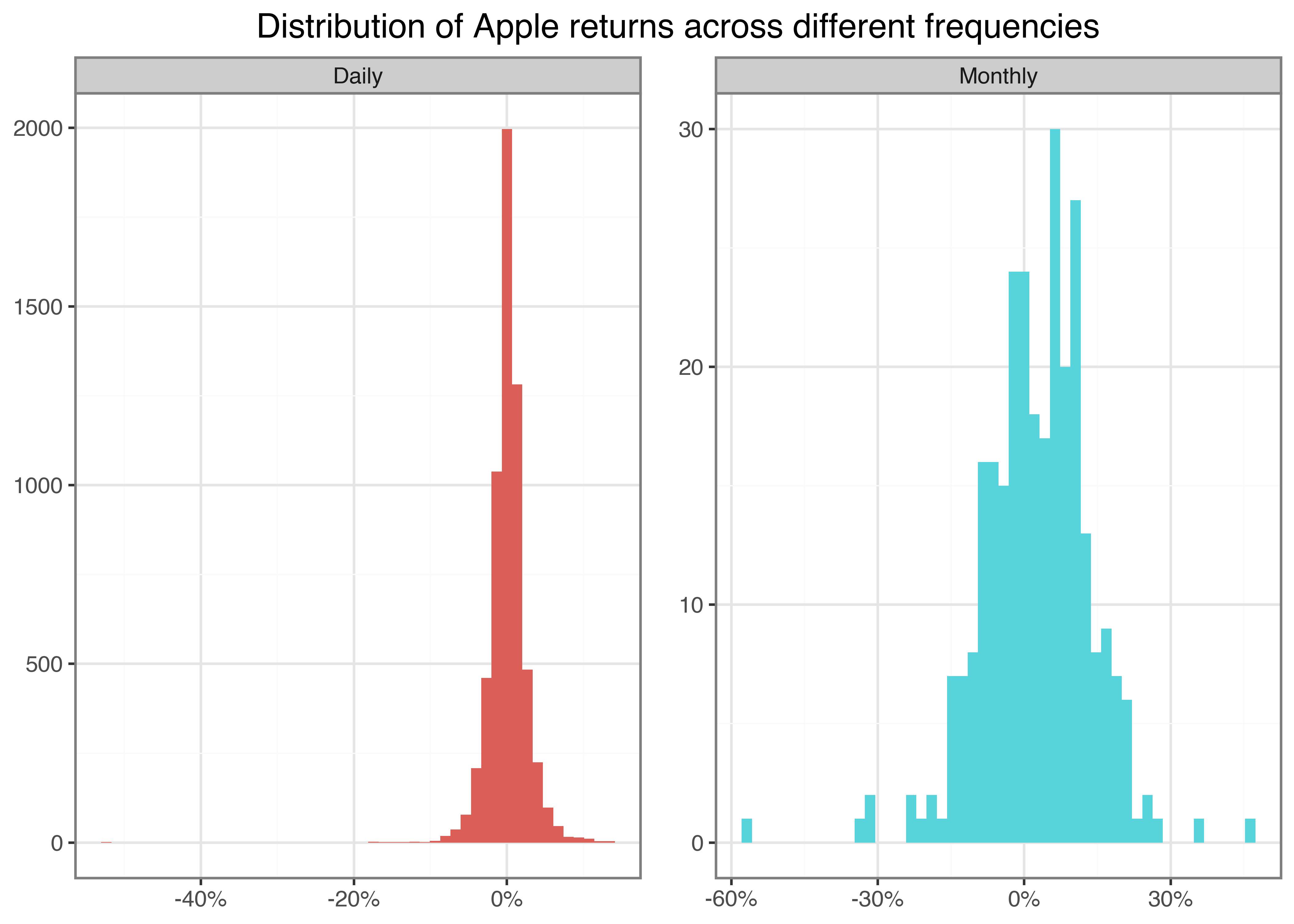
Other Forms of Data Aggregation
Of course, aggregation across variables other than symbol or date can also make sense. For instance, suppose you are interested in answering questions like: Are days with high aggregate trading volume likely followed by days with high aggregate trading volume? To provide some initial analysis on this question, we take the downloaded data and compute aggregate daily trading volume for all Dow index constituents in USD. Recall that the column volume is denoted in the number of traded shares. Thus, we multiply the trading volume with the daily adjusted closing price to get a proxy for the aggregate trading volume in USD. Scaling by 1e-9 (Python can handle scientific notation) denotes daily trading volume in billion USD.
trading_volume = (prices_daily
  .assign(trading_volume=lambda x: (x["volume"]*x["adjusted_close"])/1e9)
  .groupby("date")["trading_volume"]
  .sum()
  .reset_index()
  .assign(trading_volume_lag=lambda x: x["trading_volume"].shift(periods=1))
)

trading_volume_figure = (
  ggplot(trading_volume, aes(x="date", y="trading_volume"))
  + geom_line()
  + scale_x_datetime(date_breaks="5 years", date_labels="%Y")
  + labs(
      x="", y="",
      title="Aggregate daily trading volume of DOW index constituents in billion USD"
    )
)
trading_volume_figure.show()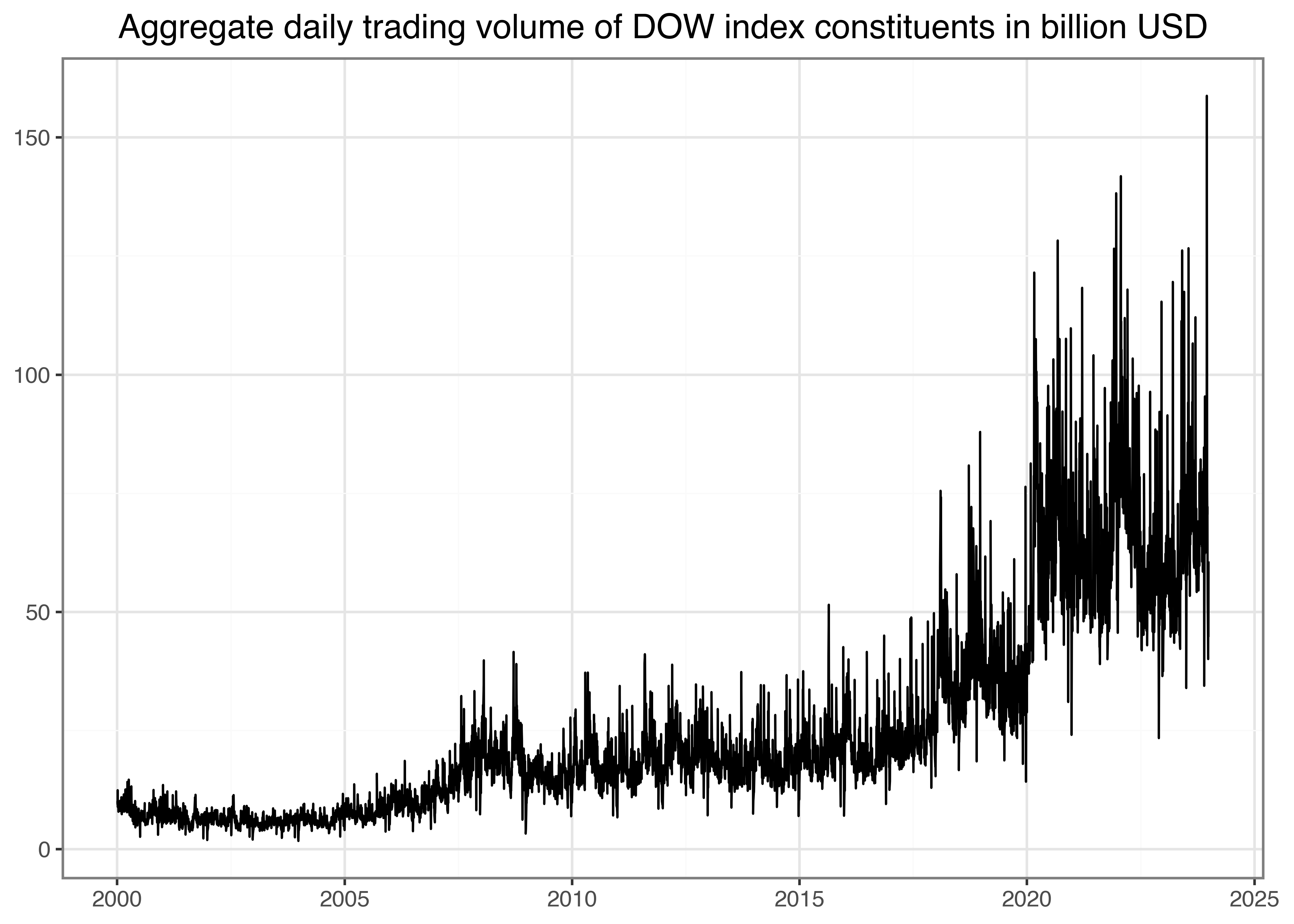
Figure 5 indicates a clear upward trend in aggregated daily trading volume. In particular, since the outbreak of the COVID-19 pandemic, markets have processed substantial trading volumes, as analyzed, for instance, by Goldstein, Koijen, and Mueller (2021). One way to illustrate the persistence of trading volume would be to plot volume on day \(t\) against volume on day \(t-1\) as in the example below. In Figure 6, we add a dotted 45°-line to indicate a hypothetical one-to-one relation by geom_abline(), addressing potential differences in the axes’ scales.
persistence_figure = (
  ggplot(trading_volume, aes(x="trading_volume_lag", y="trading_volume"))
  + geom_point()
  + geom_abline(aes(intercept=0, slope=1), linetype="dashed")
  + labs(
      x="Previous day aggregate trading volume",
      y="Aggregate trading volume",
      title="Persistence in daily trading volume of DOW constituents in billion USD"
    )
)
persistence_figure.show()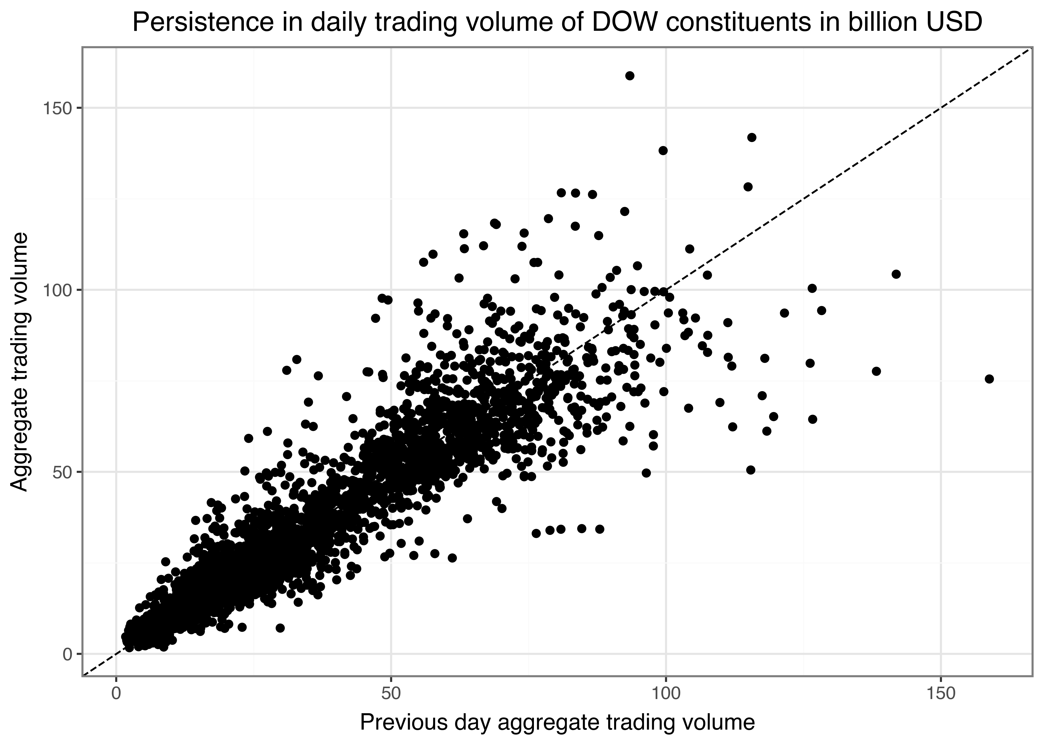
Purely eye-balling reveals that days with high trading volume are often followed by similarly high trading volume days.
Key Takeaways
- You can use
pandasandnumpyin Python to efficiently analyze stock market data using consistent and scalable workflows. - The
tidyfinancePython package allows seamless downloading of historical stock prices and index data directly from Yahoo Finance. - Tidy data principles enable efficient analysis of financial data.
- Adjusted stock prices provide a more accurate reflection of investor returns by accounting for dividends and stock splits.
- Summary statistics such as mean, standard deviation, and quantiles offer insights into stock return behavior over time.
- Visualizations created with
plotninehelp identify trends, volatility, and return distributions in financial time series. - Tidy data principles make it easy to scale financial analyses from a single stock to entire indices like the Dow Jones or S&P 500.
- Consistent workflows form the foundation for advanced financial analysis.
Exercises
- Download daily prices for another stock market symbol of your choice from Yahoo Finance using
tf.download_data(). Plot two time series of the symbol’s un-adjusted and adjusted closing prices. Explain any visible differences. - Compute daily net returns for an asset of your choice and visualize the distribution of daily returns in a histogram using 100 bins. Also, use
geom_vline()to add a dashed red vertical line that indicates the 5 percent quantile of the daily returns. Compute summary statistics (mean, standard deviation, minimum, and maximum) for the daily returns. - Take your code from the previous exercises and generalize it such that you can perform all the computations for an arbitrary number of symbols (e.g.,
symbol = ["AAPL", "MMM", "BA"]). Automate the download, the plot of the price time series, and create a table of return summary statistics for this arbitrary number of assets. - To facilitate the computation of the annualization factor, write a function that takes a vector of return dates as input and determines the frequency before returning the appropriate annualization factor.
- Are days with high aggregate trading volume often also days with large absolute returns? Find an appropriate visualization to analyze the question using the symbol
AAPL.
References
Goldstein, Itay, Ralph S J Koijen, and Holger M. Mueller. 2021. “COVID-19 and its impact on financial markets and the real economy.” Review of Financial Studies 34 (11): 5135–48. https://doi.org/10.1093/rfs/hhab085.
Harris, Charles R., K. Jarrod Millman, Stéfan J. van der Walt, Ralf Gommers, Pauli Virtanen, David Cournapeau, Eric Wieser, et al. 2020. “Array Programming with NumPy.” Nature 585 (7825): 357–62. https://doi.org/10.1038/s41586-020-2649-2.
Kibirige, Hassan. 2023. “Plotnine: An Implementation of the Grammar of Graphics in Python.” https://pypi.org/project/plotnine/.
McKinney, Wes. 2010. “Data Structures for Statistical Computing in Python.” In Proceedings of the 9th Python in Science Conference, edited by Stéfan van der Walt and Jarrod Millman, 56–61. https://doi.org/10.25080/Majora-92bf1922-00a .
Tsay, Ruey S. 2010. Analysis of financial time series. John Wiley & Sons.
Wilkinson, Leland. 2012. The grammar of graphics. Springer.